If you've ever used a component library like Material UI or Chakra UI, you've probably noticed that
some components have a prop that allows you to override the default HTML element with a different one. Based on the Button example, this approach allows the component to receive a component prop along with other props the ordinary Button component does and render a different HTML element. Components that adapt to different use cases this way are well known as polymorphic components.
On the positive side, polymorphic components offer reusability and flexibility by allowing a single component to handle multiple rendering scenarios. This reduces the necessity of creating multiple specialized components. However, there are also drawbacks to consider: implementing polymorphic components can introduce complexity and may result in limited type safety. There is a chance that they might not cover all possible scenarios, leading to potential issues. We will ascertain this soon.
Now let's take a look at the Material UI Button. Install dependencies first: npm install @mui/material. Most components (and the Button as well) may receive a component prop that satisfies the desired behavior. For example:
import Button from '@mui/material/Button';

function App() {
  return (
    <>
      <Button variant="contained">button</Button>
      <Button variant="contained" component="div" href="#">
        div
      </Button>
      <Button variant="contained" component="a">
        link
      </Button>
    </>
  );
}
Cool! This renders three buttons that look exactly the same, but if you open your DevTools to inspect them, you will see that the second element is a div element and the third one is an a. Now let's check if components may receive invalid attributes:
<>
  <Button variant="contained" target="_blank">
    button
  </Button>
  <Button component="nonsense">what?</Button>
  <Button
    variant="contained"
    size="small"
    color="secondary"
    component="div"
    href="#"
    rel="stylesheet"
  >
    div
  </Button>
  <Button variant="outlined" size="large" color="error" component="a" href="#">
    link
  </Button>
</>
So, the Button component is able to receive styling props such as variant, size or color and apply the corresponding styles. But what about the other props?
TypeScript raises an error stating that the target prop is invalid for the button element. The original button HTML element does not have such an attribute either. TypeScript also fails to understand the component="nonsense" prop. This indicates that the component recognizes specific tag names. But all of the other props inside div appear to be valid. Oops! According to the HTML specification, a div element should not have attributes like href or rel. This could potentially be a problem, and you may want Typescript to know the exact props the element receives by just providing the correct tag name. If you're interested in learning how we can create our own polymorphic component without this drawback, continue reading.
Button customization through props
We will do something similar to the Button component from Material UI. I will name it UIButton. Let's start with a simple prop-based styling component. The easiest way to do it is to extend the original HTML button element and modify it further, step by step.
import { ButtonHTMLAttributes } from 'react';

type UIButtonProps = ButtonHTMLAttributes<HTMLButtonElement>;
export default function UIButton({ ...props }: UIButtonProps) {
  return <button {...props} />;
}
Now the UIButton serves just as a wrapper for the original button and can accept the same props as the original, such as disabled, key, onClick, and so on. Now we need to enable our button component to handle custom props. I would like to add props like color to easily change the color of the button, size to change its dimensions, and variant to vary the button's appearance. Let's modify UIButtonProps accordingly:
type Variant = 'text' | 'contained' | 'outlined';
type Color = 'primary' | 'secondary' | 'success' | 'error';
type Size = 'small' | 'medium' | 'large';
type UIButtonProps = {
  variant: Variant;
  color: Color;
  size: Size;
} & ButtonHTMLAttributes<HTMLButtonElement>;
UIButton is aware of these props, but currently, all of them are required. I would like to make them optional with corresponding default values. At this stage, we can start considering how to visually modify the appearance of the UIButton based on the custom props it receives. Both Chakra UI and Material UI, as well as many others, follow the approach of adding a unique class name for each additional prop. It helps to easily apply additional styles. Personally, I prefer CSS-modules for style encapsulation over styled components. But you can choose any method you like.
Constructing class names
All right. Now we need a utility that constructs and merges class names together. It should also be capable of applying any provided class name to UIButton. You can use a tiny utility called clsx, which is designed for similar purposes. Here I will use my own, which takes just a few lines of code:
export default function mergeClasses(
  style: CSSModuleClasses,
  className: string,
  ...classes: string[]
) {
  return (
    classes
      .map((c) => style[c])
      .filter(Boolean)
      .join(' ') +
    ' ' +
    className
  ).trim();
}
The mergeClasses explanation: When you import a CSS-module, the CSSModuleClasses object contains string values, and the exact keys are not known in advance (you can also replace it with { [key: string]: string }). But if you provide the correct key, you will definitely get the required style. Therefore, you need to filter out any falsy values, combine them, and append the provided className. Then, if the className is empty, remove any trailing whitespace. If you intend to utilize it, ensure that you import the appropriate CSS-module.
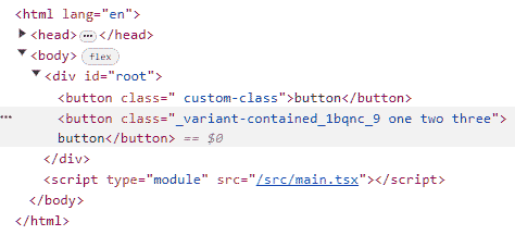
Now, if you try to use it this way:
function App() {
  return (
    <>
      <button className={mergeClasses(style, 'custom-class')}>button</button>
      <button
        className={mergeClasses(
          style,
          'one two three',
          'non-existed',
          //valid in UIButton.module.css
          'variant-contained',
        )}
      >
        button
      </button>
    </>
  );
}
You will notice that you can use it with any number of custom class names, as well as with any class names that exist in the ...module.css file. And for those that are valid, a hash will be applied.

This utility simplifies the inclusion of styles for each selected property. I've used the individual property key names (e.g., variant-, color-, size) to generate class names and have added the associated styles (don't forget to include them). So it can be utilized by using variant-${variant} or color-${color}, and the relevant styles will be automatically applied.
Now all that is left to do is make props inside UIButtonProps optional and destructure them with the default values:
type UIButtonProps = {
  variant?: Variant;
  color?: Color;
  size?: Size;
} & ButtonHTMLAttributes<HTMLButtonElement>;

function UIButton({
  className = '',
  variant = 'contained',
  color = 'primary',
  size = 'medium',
  ...props
}: UIButtonProps) {
  return (
    <button
      className={mergeClasses(
        style,
        className,
        `variant-${variant}`,
        `color-${color}`,
        size,
      )}
      {...props}
    />
  );
}
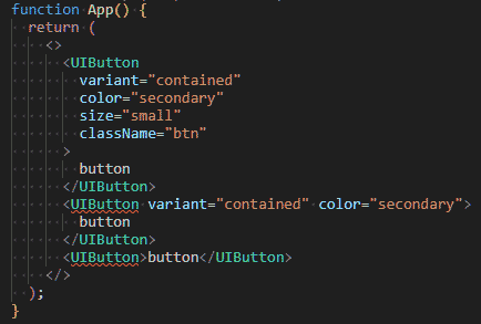
You can utilize it this way:
function App() {
  return (
    <>
      <UIButton>default</UIButton>
      <UIButton variant="contained" color="secondary">
        secondary
      </UIButton>
      <UIButton variant="contained" color="success" size="small">
        success
      </UIButton>
      <UIButton
        variant="contained"
        color="error"
        size="large"
        className="custom"
        onClick={() => console.log('clicked')}
      >
        error
      </UIButton>
    </>
  );
}
Make the UIButton polymorphic at last
The behavior implemented for the UIButton described above is commonly known as props-based styling or component customization through props. This approach is designed to offer high levels of customization and adaptability by accepting various props that modify the appearance of the component. However, to achieve polymorphism, the UIButton should not simply return a button component. Instead, it should return a component that is provided through its props.
To simplify the process, the prop responsible for specifying the component should be a valid tag name. ElementType, which retrieves the appropriate component, would be the most suitable choice for this. When no type parameters are passed, it retrieves a union of all possible components and tags.
Additionally, we should use ComponentProps to retrieve the props accepted by a component. As you may have noticed, if we provide ElementType as a generic parameter for ComponentProps, it will correctly return the props for the specified tag.
type ButtonProps<E extends ElementType = ElementType> = {
  variant?: 'text' | 'contained' | 'outlined';
  color?: 'primary' | 'secondary' | 'success' | 'error';
  size?: 'small' | 'medium' | 'large';
  as?: E;
} & ComponentProps<E>;
Now the UIButton should be fixed a little bit to be able to accept a generic and return the button element if a prop as is not provided.
function UIButton<E extends ElementType>({
  as,
  variant = 'contained',
  color = 'primary',
  size = 'medium',
  className = '',
  ...props
}: ButtonProps<E>) {
  const TagName = as || 'button';
  return (
    <TagName
      className={mergeClasses(
        style,
        className,
        `variant-${variant}`,
        `color-${color}`,
        size,
      )}
      {...props}
    />
  );
}as prop to a capitalized variable. You will get an error if you try to return <as /> directly.
So you can already utilize your polymorphic component. This approach will be sufficient in many scenarios, but we can take it a step further: you might consider excluding all the props listed in ButtonProps from the ComponentProps. Just modify types as follows:
type ButtonUniqueProps<E extends ElementType = ElementType> = {
  variant?: 'text' | 'contained' | 'outlined';
  color?: 'primary' | 'secondary' | 'success' | 'error';
  size?: 'small' | 'medium' | 'large';
  as?: E;
};

type ButtonProps<E extends ElementType> = ButtonUniqueProps<E> &
  Omit<ComponentProps<E>, keyof ButtonUniqueProps>;
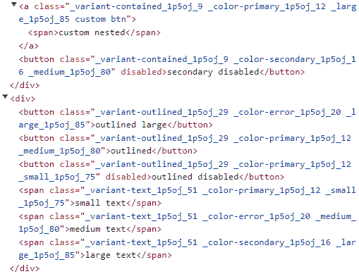
An example of usage the exact same component with different props and elements provided:


